
Good UX within a video game can make or break the whole experience and will either lead to continued play or will cause the user to disengage due to frustration or boredom. The same goes for designing an app, website or even print material.
I’ve played a lot of video games in my life. So, recently I started thinking about the similarities between a great user experience while playing a game and while browsing a website. Here are three UX design lessons I’ve learned from one of my favourites, "Zelda: Breath of the Wild".
Progressive Disclosure: Introducing Options Only When They’re Necessary
I splurged. I bought a Nintendo Switch and instantly jumped at the opportunity to play nostalgia inducing games like "Zelda: Breath of the Wild". After playing for several hours, I realized how easily I was immersed in the game.
Nintendo games are based heavily on the idea of progressive disclosure. Which is the idea that initially, the user is exposed to essential features that are relevant in the moment and as they progress, so do the options that are presented for use. It’s all about not overwhelming the user with options and only introducing new options when they are necessary.
In "Zelda: BotW", when the player begins their journey, they’re limited to an area called "The Great Plateau" until they complete a series of tasks. These tasks teach skills gradually to ease the user into Link's abilities. Each of these tasks teaches the user a bit about the world around them. When they are ready to leave an area they’ve learned most of the game mechanics and features.
The benefit to this approach is that a) you’re not overloading the user with information they don’t need and most likely won’t remember and b) it fills the users with a sense of accomplishment because they discover and solve each puzzle on their own. For beginners, using progressive disclosure helps to prioritize their focus and teaches them by gradually building levels of knowledge. For experienced users, it helps them move quickly through areas and improves enjoyability.
Subtle Feedback: Creating a Positive Learning Experience
Within the game, environment feedback is essential to a great play experience. If you were to walk across lava and there was no direct impact on the player, learning that lava causes damage would be tricky, and the result might be a frustrating in-game death.
Having a damage indicator helps the user learn which environmental factors are positive and which are negative, thus improving the overall experience by decreasing the chance of frustration. The same goes for positive feedback. Imagine a puzzle can only be solved by moving a heavy stone. Creating auditory feedback - the stone grating as it travels across the ground is a great option here - and a joyous sound when the rock reaches its final destination gives the user positive feedback while letting them know that moving the stone to point x is exactly what they are meant to do.
A great example of subtle feedback in "Zelda: Breath of the Wild" is entering a cold area. Initially, Link’s breath will be visible, giving you the first hint that climate affects him. Soon after Link will begin to shiver and shake, warning the user that the environment is cold enough to cause damage.
What’s brilliant about this approach is that the player can’t help but empathize with the character. This empathy motivates the user to choose clothing or food that will get him back to feeling comfortable. If left unchecked the cold will cause environmental damage, and you will begin to take health damage. This helps the user make informed choices about proper clothing for each environment and planning progress through the different climates in the world.
Unobtrusive User Interfaces: Perfectly Balancing Style and Function
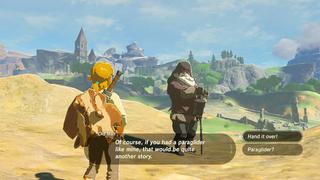
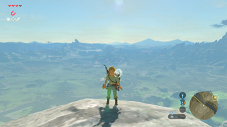
The user interface within a game is not the central focus; it’s the red carpet that leads you to the main event. It’s essential that it be present—if needed—but more importantly that it be unobtrusive. Whether it’s the menu screen or the HUD (heads-up display), good GUI (graphical user interface) should be easy to understand and to navigate while fitting seamlessly within the style and tone of the overall game.
In "Zelda: BotW" the HUD that sits over your gameplay is informative, functional and almost invisible. The well thought out minimal design allows the environment to immerse the player in the game. At the same time, the HUD also gives you a diverse set of information that helps you navigate the world around you. It keeps you posted about your health, what time of day it is, current weather conditions, what d-pad buttons are mapped, and more.
While the user interface is present, it isn't overly complicated or colourful and doesn’t scream to get your attention. For advanced users, or those looking to enhance the environmental design, you can even turn the UI off and experience the game without distractions. Additionally, when you enter the menu screen, each section is defined, easy to navigate, and fits within the games overall style.
Cognitive Burden: Adding Complexity through Mental Workload
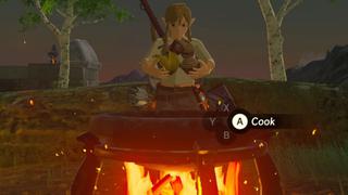
"Breath of the Wild" is a vast game, but it's far from perfect. I can't sing its high praises without also pointing out some room for improvement. With UX design your goal is to make every experience within the game harmonious and fun, but sometimes promoting a value (like exploration) forces other values to become less prominent. For example, cooking in "Zelda: BotW" does not follow best practices for mental workload and enjoyability. The cooking process is overly complicated and places cognitive burden on the user.
The complexity stems from the actions required to create a dish. To create meals you enter the menu, go to the item and select ‘hold’ from the options, choose the next item and select 'hold' exit the menu and then select ‘cook’ when over a cooking fire. Now, try doing that ten times fast!
The second issue is that cooking places a heavy cognitive load on the user because there is nowhere in-game to store your learned recipes. This means that all recipes are stored outside the game, either in the user's head or on a notepad. Realistically, neither of those options work, as according to George Miller—who studied the limitations of short-term memory and discovered that we could only remember seven things, plus or minus two (meaning between five to nine items). Plus, who's actually going to write them down and refer to them? Not me.
What's puzzling to me is that Nintendo must have seen this issue and chose to ignore it while testing. A solution to this problem would be to create a cooking interface presented when interacting with a cooking fire. This interface could store all recipes you've made before and could serve as the creation start point. Pick a recipe from the list, if you have the necessary ingredients you could select it and...BAM, it's food time! This could even facilitate the creation of multiple recipes at the same time.
Okay, Hands Down. What Did Playing Video Games Teach me about User Experience?
- Design your user experience with ‘right now’ in mind. Give the user information and abilities relative to what they are doing at the moment and keep it simple.
- Users will feel accomplished and satisfied when they have learned functions on their own.
- Feedback should be subtle but important.
- The interface should never get in the way of progress. Don’t sacrifice function for style.
Overall, great UX and UI should be nearly invisible. If done correctly the user experience improves productivity and contributes to the joy of using a product and can excite the user to show and tell others about their amazing experience. For most people a great user experience is obvious, but behind the scenes, it takes a great deal of research and practice to get it right.