Circular .
In an era defined by environmental consciousness and sustainability, Circular has cemented themselves as a beacon of innovation and responsibility. With a mission to redefine waste management practices globally, Circular stands at the forefront of a shift towards circular economy principles.
Services provided:
- Project management and planning,
- Strategy,
- User Experience,
- User Interface Design,
- Content Management System Development,
- Quality Assurance Testing,
- Content Population,
- Acceptance Testing
Strategy
The client’s need for a new website, built on Webflow for easy evolution, stems from the limitations of their current platform which lacked flexibility and scalability, as well as several strategic goals.
Through our iterative wireframe process, we collaboratively architected a modularly designed website that aims to inform potential clients about their innovative platform that modernizes the recycled plastic supply chain, and provides a tool for clients to manage their use of recycled plastics. It seeks to drive revenue by tapping into the market of environmentally conscious companies, educate stakeholders about using recycled plastics, and differentiate the company by showcasing its unique supply chain connectivity. Serving as a digital equivalent to successful in-person pitches, the website presents cost-effective sustainable material solutions, making it a strategic tool for the company’s growth.
Design
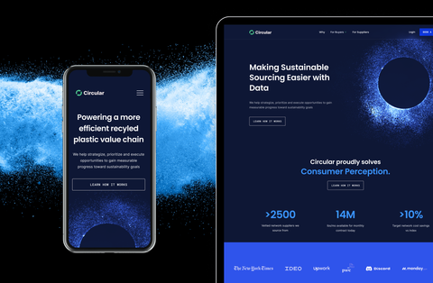
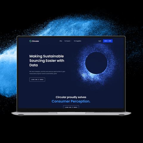
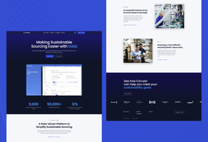
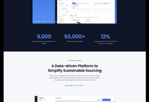
Circular needed a website that would showcase their product in the best setting possible, while also employing visual content that simplifies the message for prospective clients.
Given that the product’s development was ongoing, the website had to be able to adapt, and have the ability to grow for the future. It was crucial for the website to be clean and simplified so that it could grow alongside the company. Abstract visuals were introduced to communicate the essence and intent of the product, sidestepping the need for the product to be completed. The incorporation of dark and light modes to the website highlights critical information to help viewers digest the robust nature of the product.
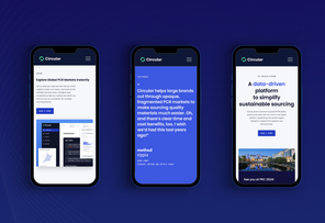
Given the complex nature of Circular’s product, our primary focus was ensuring that users grasped a clear understanding of Circular's identity and the nuanced benefits of its work. Catering to a diverse range of audiences, Craft&Crew created UI designs that effectively showcased the interplay between the recycled plastics buyers industry, and Circular's broader role in environmental sustainability.
By zeroing down on specific primary and secondary colors we were able to establish a visual foundation that would enhance their brand recognition and identity. Additionally, we incorporated abstract imagery to the brand narrative, allowing the website to offer visual pauses that enrich the user experience without relying heavily on content and repetitive product shots.
Development
Our team has successfully constructed a website that is both highly scalable and flexible. This was achieved by harnessing the extensive features and capabilities offered by Webflow, such as CMS collections, components, variables, custom code, and interactions. This strategic approach has empowered the Circular team with a robust balance of scalability and flexibility. Moreover, it has facilitated the consistent and effective visual representation of their brand.
We utilized key Webflow features that enabled the creation of reusable modules and styles, so the client team can build a variety of pages (or even create new components from scratch) and not have to worry about applying the right colors, fonts, and layouts etc.
